Mapping the Customer Journey in Real time with the IBM API Connect Offering Management Dashboard
"IBM API Connect is a full lifecycle API management solution that uses an intuitive experience to help consistently create, manage, secure, socialize and monetize APIs, which promotes digital transformation on premises and across clouds." — IBM API Connect
Impact
- Saved 40+ hours per month of offering managers' time that was being spent manually updating spreadsheets by automating the update process
- Improved offering managers' ability to make data-backed decisions about product features and KPIs through real time data updates
- The art of the possible! With just a small team, we brought our vision to life, from concept to execution
- Demonstrated the value of design thinking principles to a skeptical group of offering managers
Introduction
The Offering Management Dashboard was an effort led by IBM API Connect offering managers to identify and monitor key performance indicators in the product purchase flow. The goal of the dashboard was to help offering managers make better and more informed decisions about the product by engage with product analytics at all stages of the user journey.
This was currently being done with a convoluted set of Excel workbooks that had to be updated manually, taking hours and eventually even whole days of valuable time away from the offering management team. This dashboard completely eliminated the time spent manually updating spreadsheets.
My role was design and data visualization as well as helping with implementation. The dashboards were designed in Adobe Illustrator and implemented in Tableau. The data was sourced from the IBM Data Lake and updated live in Tableau.
Tools Used:
- Enterprise Design Thinking
- Data Visualization
- Journey Maps
- Adobe Illustrator
- Tableau
- SQL
- Excel
The Team
- Kelly H. - Offering Manager
- Alan U. - Design Lead
- Austin L. - Design Intern
- Stephanie P. - Tableau Developer
Design Thinking
"You're not going to do any of that design thinking mumbo-jumbo, are you?" — Kelly H., Offering Manager
Enterprise Design Thinking
Enterprise design thinking represents a deliberate approach to harnessing the expertise of diverse teams, with the goal of driving innovation and brand differentiation at scale. Originally developed by IBM, this framework has since been adopted across industries as a means of facilitating collaboration on complex, enterprise-level projects.
Hills
Hills statements in Enterprise Design Thinking are phrased as “Who/What/Wow!” statements. For larger projects it’s recommended to pick three (and only three) hills statements to focus on. Because this design was a quick turn around we only had one hill:
"Use the available data to allow offering managers to track a user and measure KPIs through the entire journey from discovery to purchase."
Who: API Connect Offering Managers
What: The available data
Wow: track a user through the entire journey from discovery to purchase.
Sponsor Users
Key stakeholders from the API Connect offering management group played an invaluable role as 'Sponsor Users' - bringing their unique perspectives and expertise to the project table. Throughout the initiative, they provided critical guidance on user needs, helping us stay attuned to real-world requirements and ensure that our solutions addressed the most pressing challenges.
Playbacks
Regular playbacks provide a unique opportunity for stakeholders to share their perspectives and insights, helping to ensure that everyone is aligned around the bigger goals and objectives. These facilitated discussions serve as a safety net, allowing teams to explore potential missteps, gauge progress, and make adjustments on the fly - all while keeping sight of the overarching problem you're trying to solve.
Kelly, our offering manager was leading the effort so our weekly playbacks centered around her. At key milestones we also played back our designs to the rest of the offering management team.
User Testing & KPI Validation
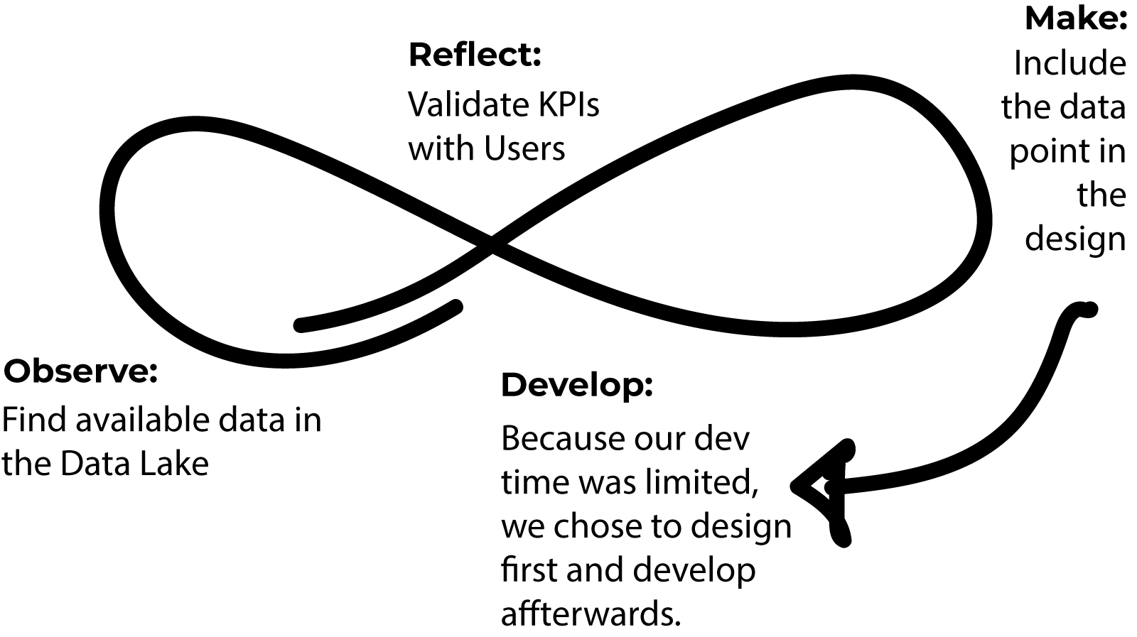
Since this was a grassroots tool for internal users, finding sponsor users to validate the design was relatively straightforward. Kelly consulted the group of APIC offering managers for key performance indicators that they considered valuable. We searched the available data sources for data, and where it matched, we designed in a space for it.
The fluid nature of this design process meant that our design changed as we received feedback, but only when data was available. KPIs were validated by interviewing stakeholders and users of the product and tested with the offering managers. We tested our designs by asking Offering Managers to find a specific KPI and interpret the meaning of it. This yielded valuable insights like showing not just a final number such as a conversion rate but also the metrics that went into that calculation.
Information Architecture
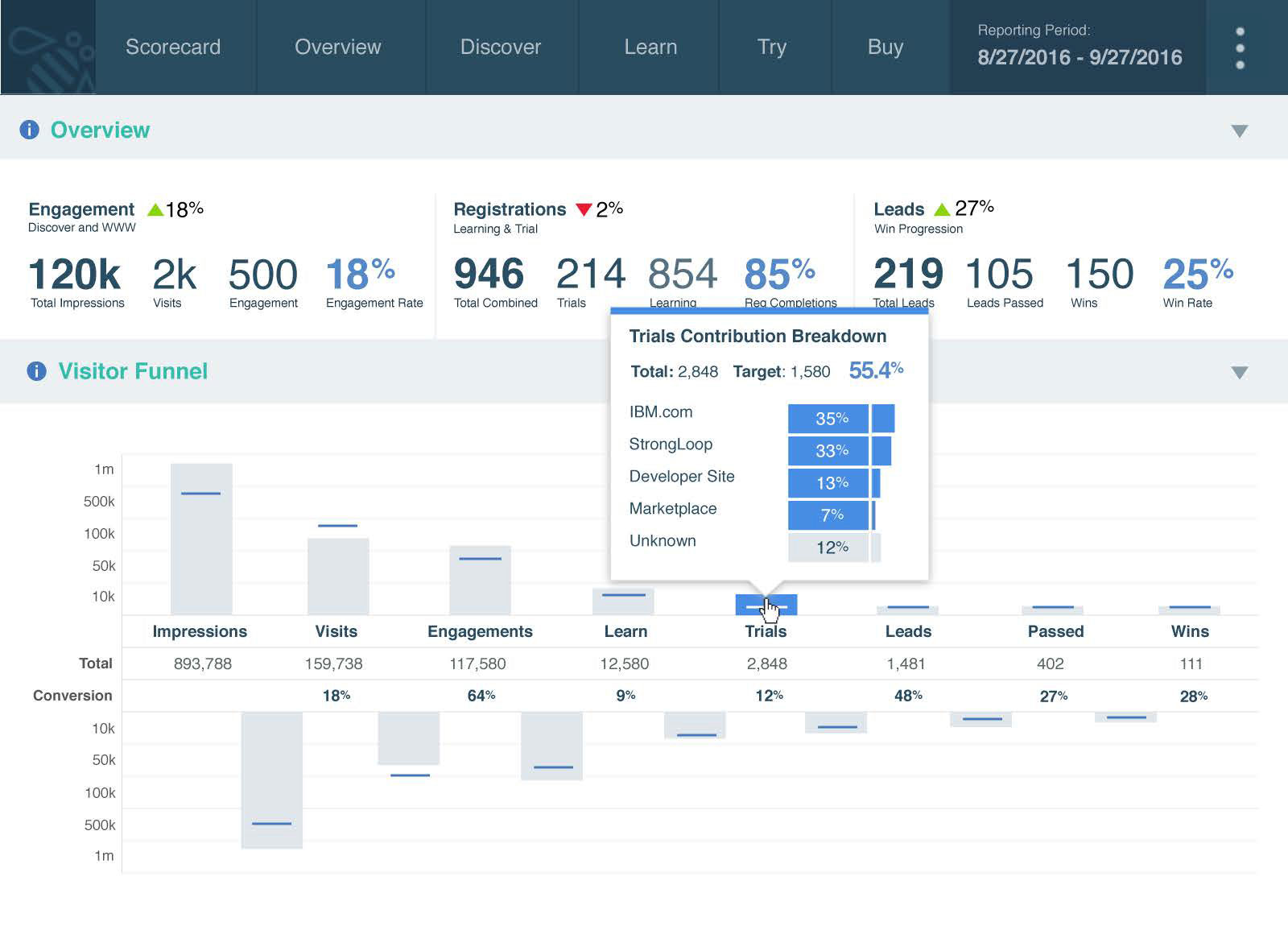
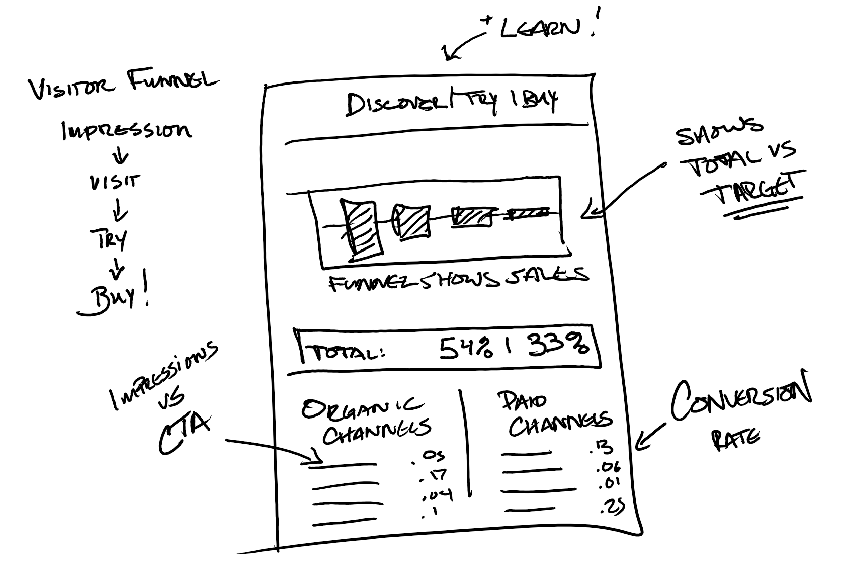
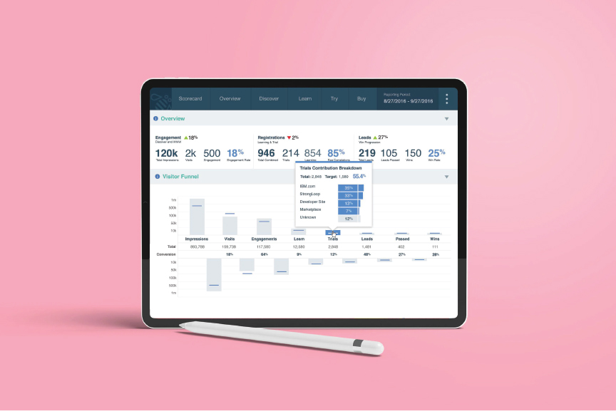
The page navigation for the dashboard mirrors the customer journey with its tabs: Discover, Learn, Try, and Buy, reflecting the customer journey map created by the team. with the first page showing an overview including the funnel of leads through all four pages and a traffic breakdown for all properties.
Data Visualization
We used industry standard best practices to create visualizations that were both attractive and effective to present the data in the best way possible, using Tableau to connect the data to the visualization. This makes it simple for the offering managers to navigate and maps directly to the customer experience.
Visitor Funnel
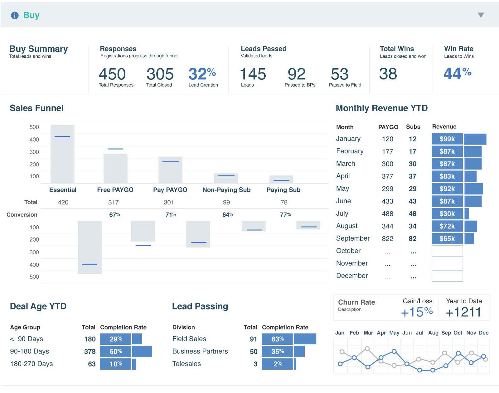
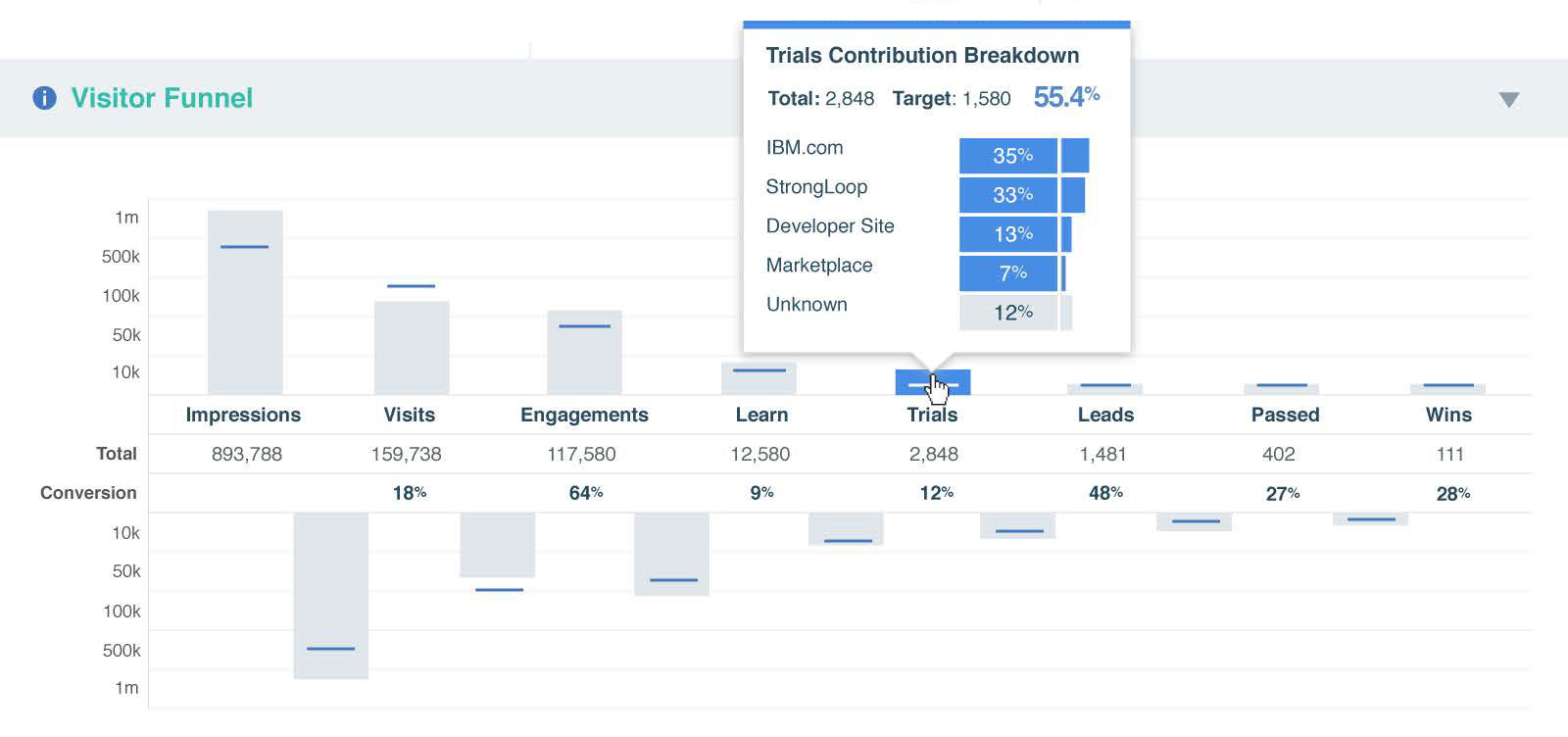
The Visitor Funnel shows conversion rates between each step of the customer journey. The funnel was the most crucial piece of information that offering managers needed and the most complex to visualize. The visualization style shows both the actual value and the target value, giving offering managers the ability to quickly see where targets are being met or exceeded and where more effort should be concentrated to improve conversion rates.
Feltron Numbers
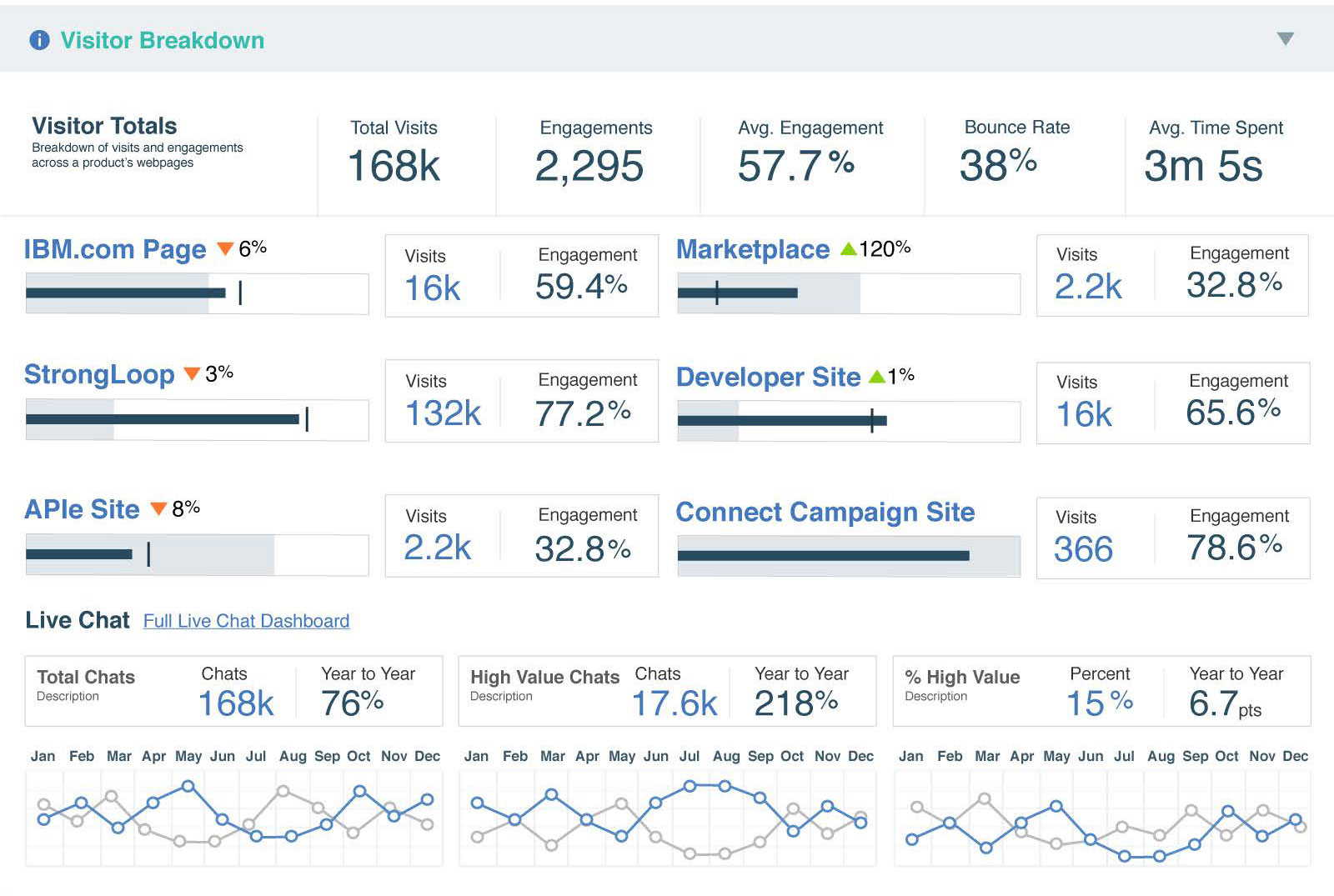
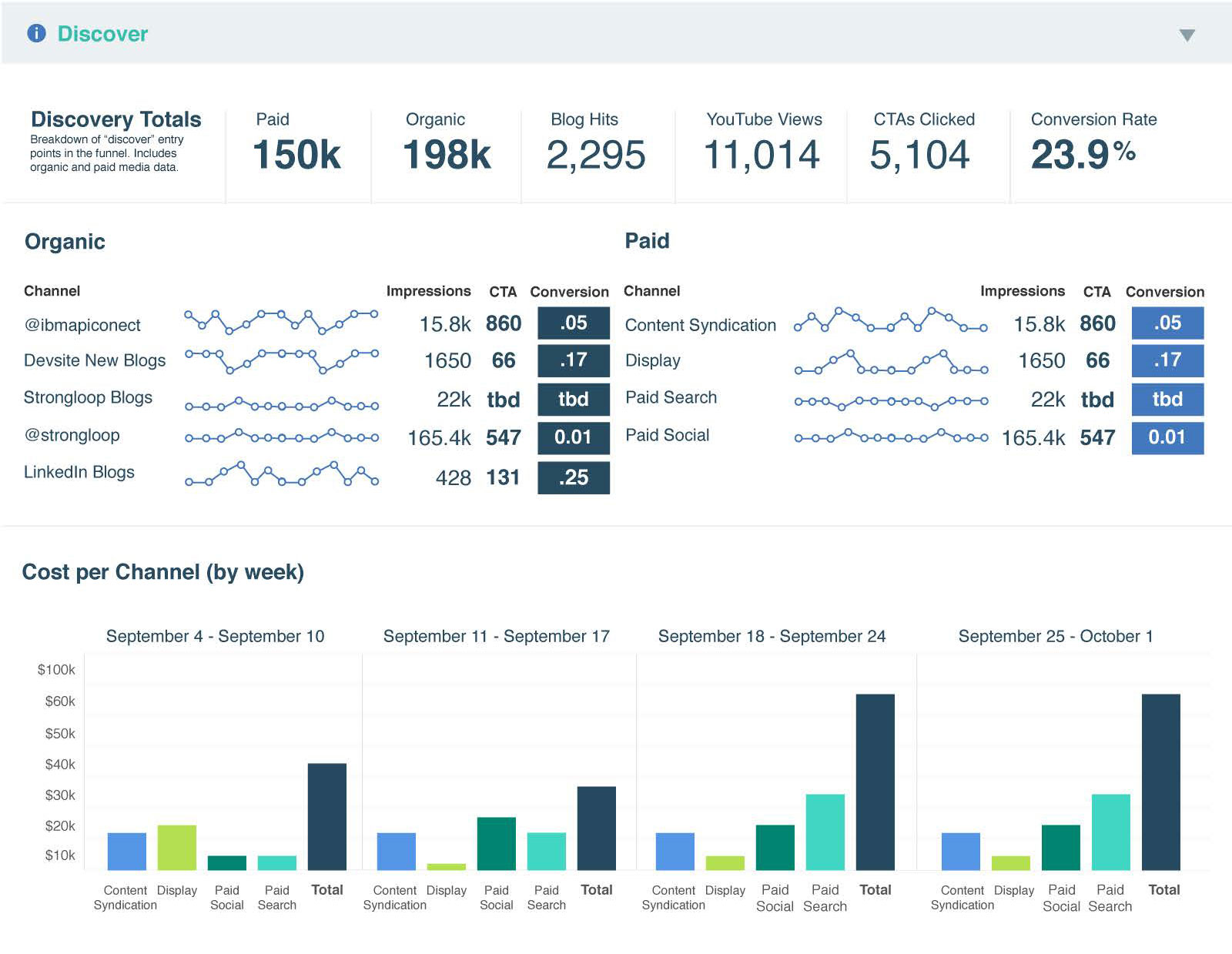
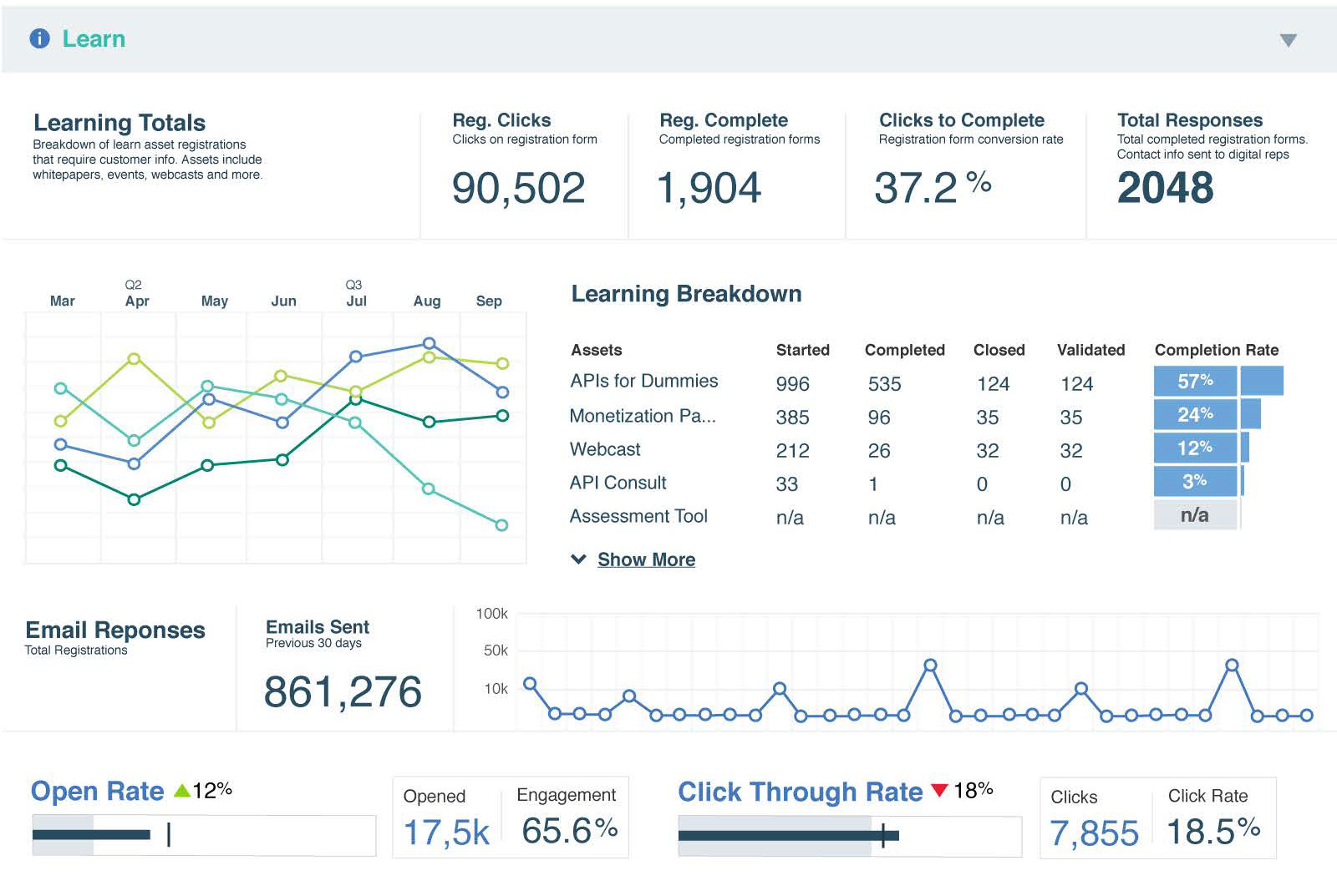
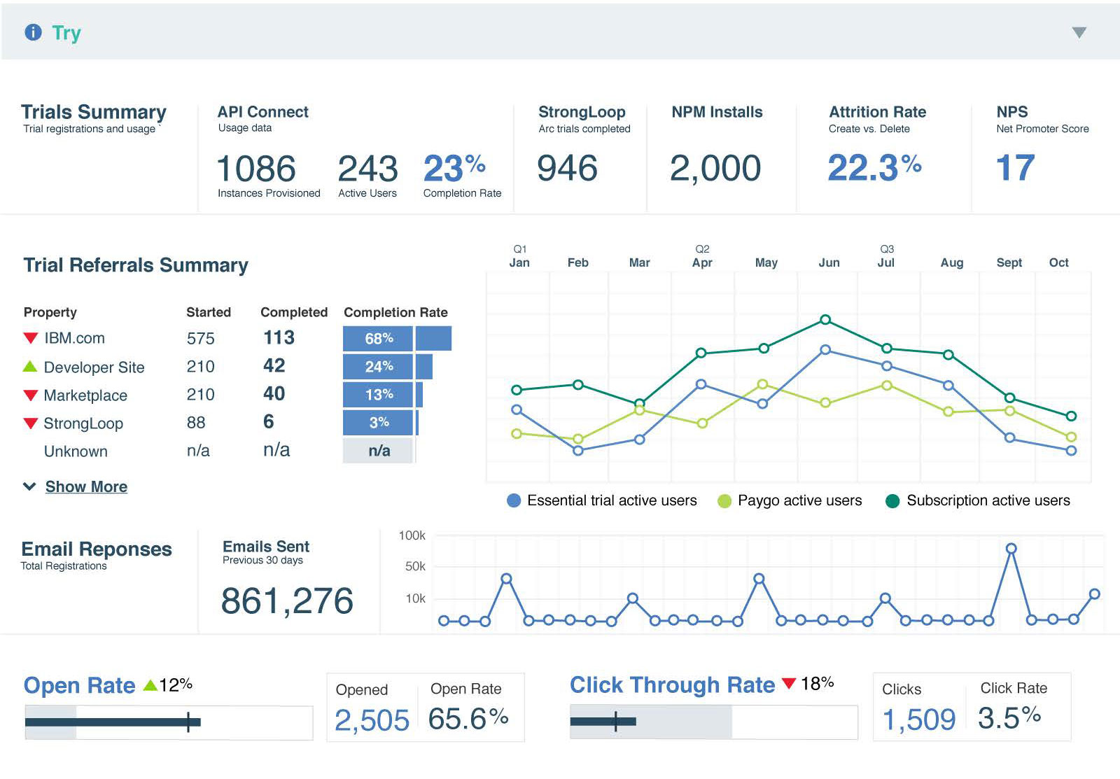
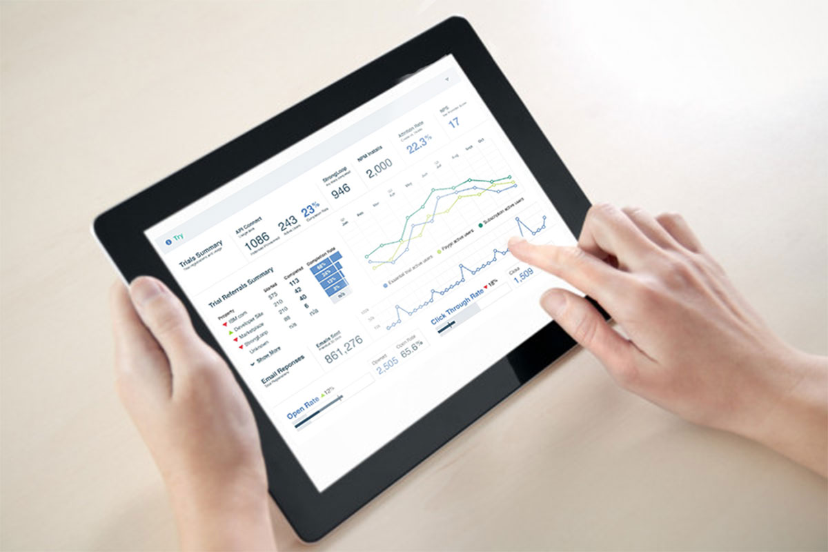
Important KPIs were styled as “Feltron Numbers” across the top of each page for easy readability and quick scanning, giving offering managers all of the information they need for a given step in the journey at a quick glance and then allowing them to drill into specific metrics with a simple scroll action.
Point in Time Metrics
For any point in time measurement, there is always a sequence measurement as well, even if it is not directly available from an API or Data Lake. To get sequential data, we periodicaly cache point in time measurements, allowing for trend calculations, spark charts, and spark lines. Although we did not use predictive measurements for this dashboard, time sequence data also allows for predictive analytics.
Sparklines
Sparklines are a small chart that provides a visual representation of data over time. Sparklines were introduced by Stephen Few in Information Dashboard Design: The Effective Visual Communication of Data. While sparklines are not intended to show specific data points. they are perfect for showing data over time, highlighting trends, and make quick comparisons of a point in time metric to past performance.
Bullet Graphs
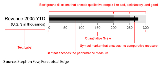
Bullet Graphs were also introduced by Stephen Few in in Information Dashboard Design: The Effective Visual Communication of Data. They have the advantage of packing a lot of information into a very small space. While bullet graphs may be unfamiliar at first, they are easy to learn to read and once learned, bullet graphs convey a large amount of data in a small space. Our bullet graphs were a slight variation on Stephen Few's formula. The background range was only a single color showing the range of What was considered a positive range for the data point. The vertical line in the chart labeled by Few as a "comparative measure" represents the target measurement, allowing an offering manager to easily know whether a given metric has hit or missed its target, and allowing them to take action if necessary.
Summary Graphs
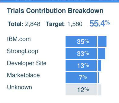
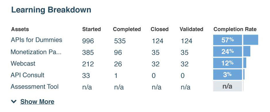
Rather than just presenting metrics, where appropriate we sorted from greatest to least, showing the relative performance of channels, contributions, learnings, or other media formats. The summary graphs allow an offering manager to quickly see which channels perform better and by what ratio than others. While low in information density, summary graphs allow for quick and easy visual scanning of data without having to compare numbers to numbers, making it simple to quickly compare a sequence of percentages.
Visual Design & Development
The visual design was blocked out in Adobe Illustrator using basic shapes as the data was confirmed. Since we had limited development resources for Tableau, we focused most of our prototypiing efforts on Illustrator. We hallway tested our designs by asking Offering Managers to find a specific KPI and interpret the meaning of it and then worked on sourcing the data in the IBM Data Lake.
It was actually really hard to do this in Tableau. While we were able to find a few Tableau specialists internally, it was challenging because IBM actually makes a competing product (SPSS) so Tableau was not commonly used within the company. While we all contributed to the development effort in an all hands on deck fashion, we also hired a consultant from Tableau to help with implementation. The developer listed on the team above was actually a consultant hired from Tableau itself. This greatly sped up time to delivery.
Reflections
The original single page design was too much for the Tableau product to handle. Everyone was pleased with the tabbed flow but it did make comparison between pages somewhat more difficult.
Hallway testing with the actual users worked really well. We don't always get to test our designs with the users as we are designing them, particularly in enterprise environments, so this was a huge luxury and contributed immensely to the overall quality of the outcome.
If I could build this dashboard again today, I would use Tiny Time Mixers from IBM AI to start making predictions, but TTM did not exist when we built the dashboard.

